The Making of: Orbital Decay, Part 2
…or how to make the graphics (when you’re not an artist).
I planned Orbital Decay as a solo enterprise and making the graphics took most of the time: out of the 5 months it took for the project to finish, 3.5 were allocated for the graphics. I opted out for a retro-pixel art-“16 bit graphics” style, as a homage to that gaming era and because I wanted total control for the details on the assets, a thing pixel art is good at for this small resolution (e.g. ports, turrets, hatches, etc).
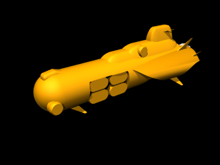
For each ship, I followed, more or less, a routine: researching for a design (this included the general shape and the details, big and small), 3D modeled the shape and the rough details with Truespace, rendering a side view of the ship, then start editing at the pixel-level in Photoshop. The whole process usually took about a couple of days to a week, intricate ships like the Radiant Star or the Aru Destroyer took even more.
Here’s how this worked, in visually comprehensive but not exhaustive way:


As a side note, the design of the raider capital ships (the frigate and the carrier) date back a very-very long time ago – when we’re designing the Pure Power universe, submarine-shaped space-ships were supposed to fill the fleet ranks of one of that game factions.
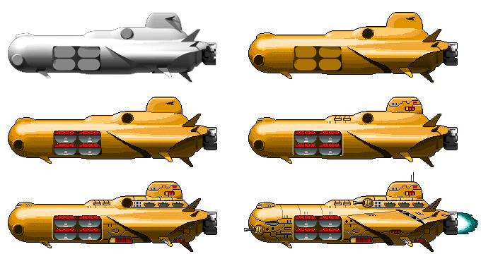
Anyway, here’s the making of the raider frigate:


In the hind-sight, I feel that I should have kept more frames from the making of, they look pretty funny. And instructive too! 🙂
On to the actual pixeling technique. After the side render was imported in Photoshop, I used “Levels” to cut it down to n (n was usually, 8, 12 or 16) levels. Then, I prepared one or more gradient palettes containing shades. For example, in the particular case of the raider ships, there were 2 gradient palettes, one for the base color (the orange) and one for the details (the grayish shade like the tail engine and other details). Then, the fill tool was used to fill each strip with the corresponding shade in the palette.
After the rough pixelated sketch followed the detailing with grates, bolts, channels and the whole lot of devices a starship is supposed to need 🙂 Then, depending on the actual look, I took some time to add shadows for a more “volumetric” look – at this stage, I used the pixel-tool or even the brush, sized 2 or 3, with black or whites and alphas in fixed percent steps (25-50-75 or 33-66). I’m pretty sure the pixel-art purists will be horrified by the barbaric defacing using an alpha brush 🙂
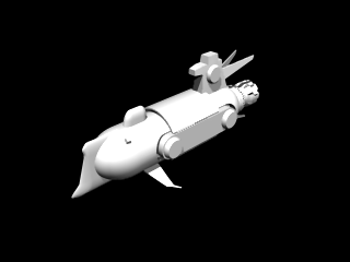
Designing the player ship, the Radiant Star, was a frustrating task. I experimented with a couple of designs, but the results weren’t offering a certain bulky-massive feeling I wanted to achieve. One of the earlier incarnations was looking like this:

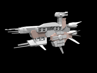
After some more research, I settled on the carrot shape relatively similar to one of a Vaygr carrier from Homeworld game series.
As I said earlier, I’m no pixel artist, so along the actual graphics, I had to create a process to mutate the 3D skills to the pixel-art I was trying to achieve. In the end, I’m quite happy of the results 🙂
